The new Speed report has quickly become our most visited report. This improved visualization helps teams quickly identify work items that are out of the “ordinary” to enable process improvement. Keep reading to learn how to get the most out of the Speed report.
Cycle Time Scatter Plot
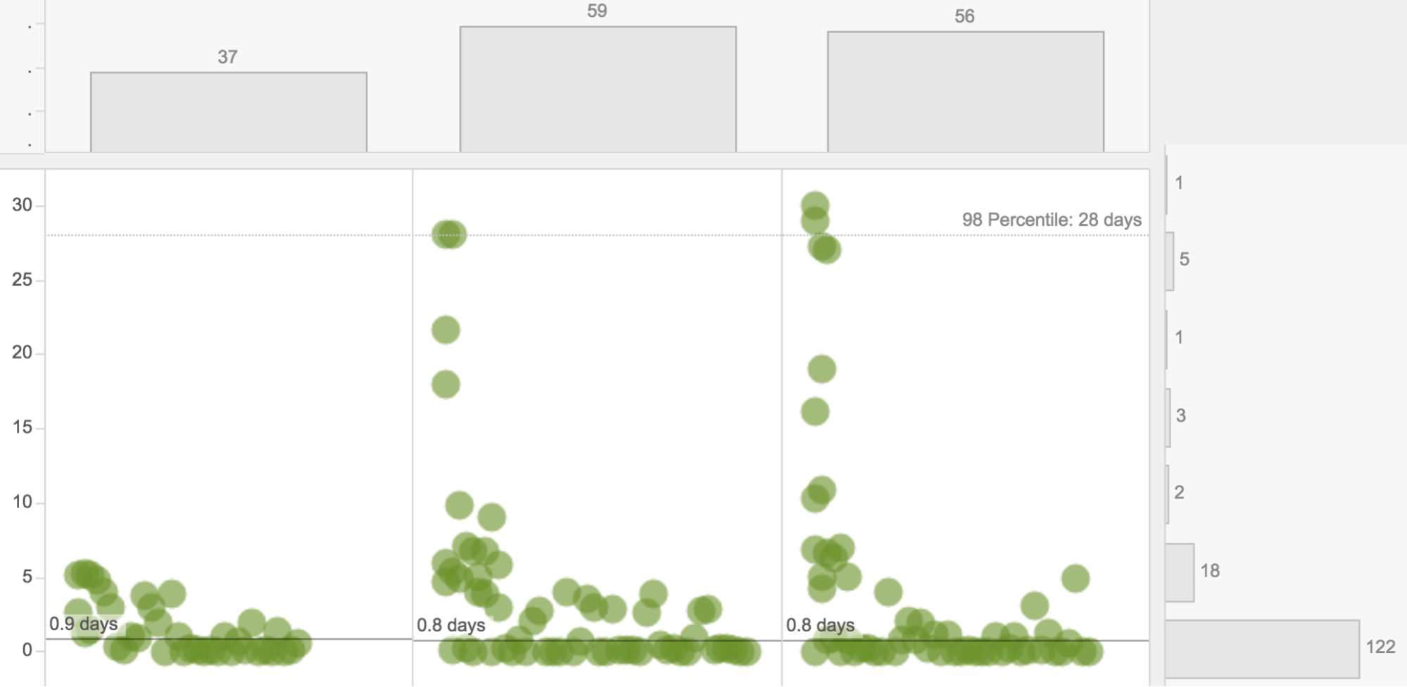
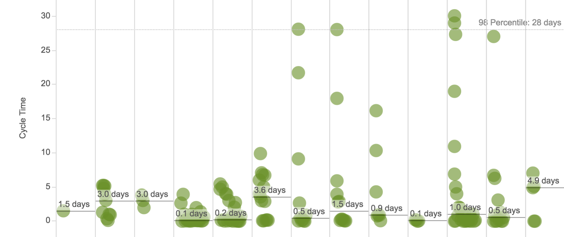
In order to make informed process improvement decisions, it’s essential to know how long it takes work to complete. The scatter plot is organized into daily, weekly, or monthly views to help draw comparisons over time. The Card Type filter panel lets you look at all work or specific types of work. And you can click and drag to select data points that are interesting to dig in and get more context.
- The scatter plot section shows “finished” cards by day, week, or month.
Recognizing Workflow Patterns
Based on guidance from Troy Magennis, longtime Planview AgilePlace colleague and process analysis master, if you see that there are dramatic changes in the “average line” for a given type of work each day/week/month, it’s a signal that more investigation is needed. Of course, it may turn out that it’s due to holiday schedules or other circumstances that can’t be adjusted. However, some other interesting things to look for include:
Increase in Outliers
This could be an indication of a type of work that limited people on the team know how to do. It may be a signal that it’s time to increase focus on cross-training. This could also demonstrate that there is an external dependency that’s holding up progress.
“Bunched Up” Cards
When multiple cards are located in the same general area, the density of the of data darkens the color on the graph. This may mean that you have a process issue, which is contributing to work being done in batches, rather than one at a time. It’s worth taking time to understand if there are opportunities to avoid wasteful batching, and experiment with solutions. You could try limiting the number of items flowing through at the same time. Or, you could change the process to limit waiting, for example, by handling reviews/sign-offs as they come up, rather than once a week.
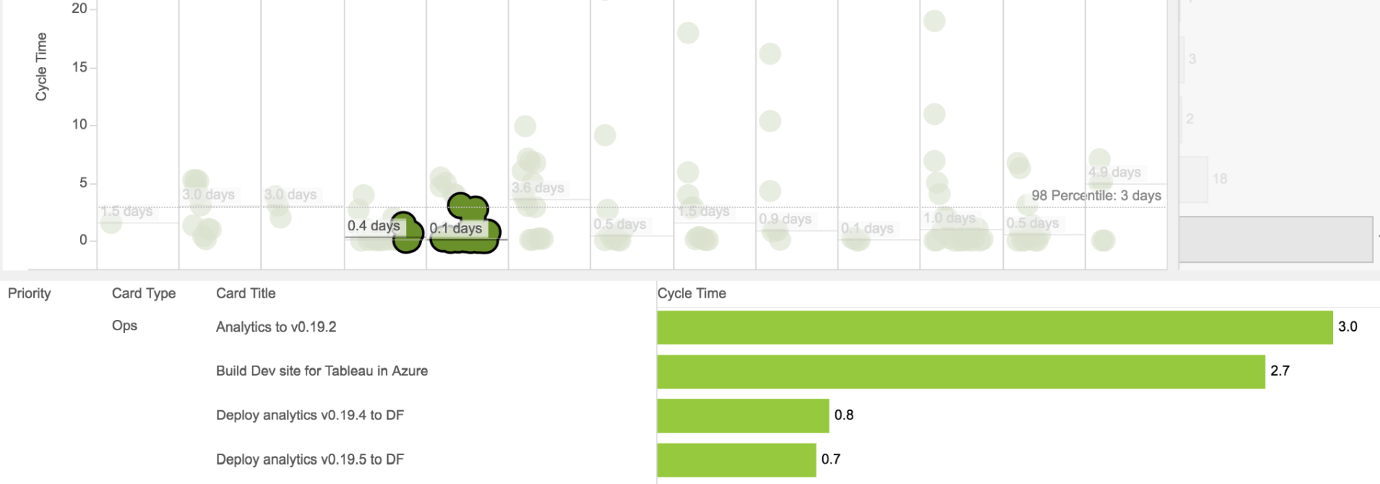
- Click and drag over multiple points to assist in research.
Understanding Service Levels
Being able to evaluate — and communicate — what percentage of work could be completed on or before a given number of days can be tricky. Our Percentile Value Input enables you to specify the level of certainty you want to communicate. The reference line in the scatter plot shows the value (in days) that can be communicated and with what level of certainty.
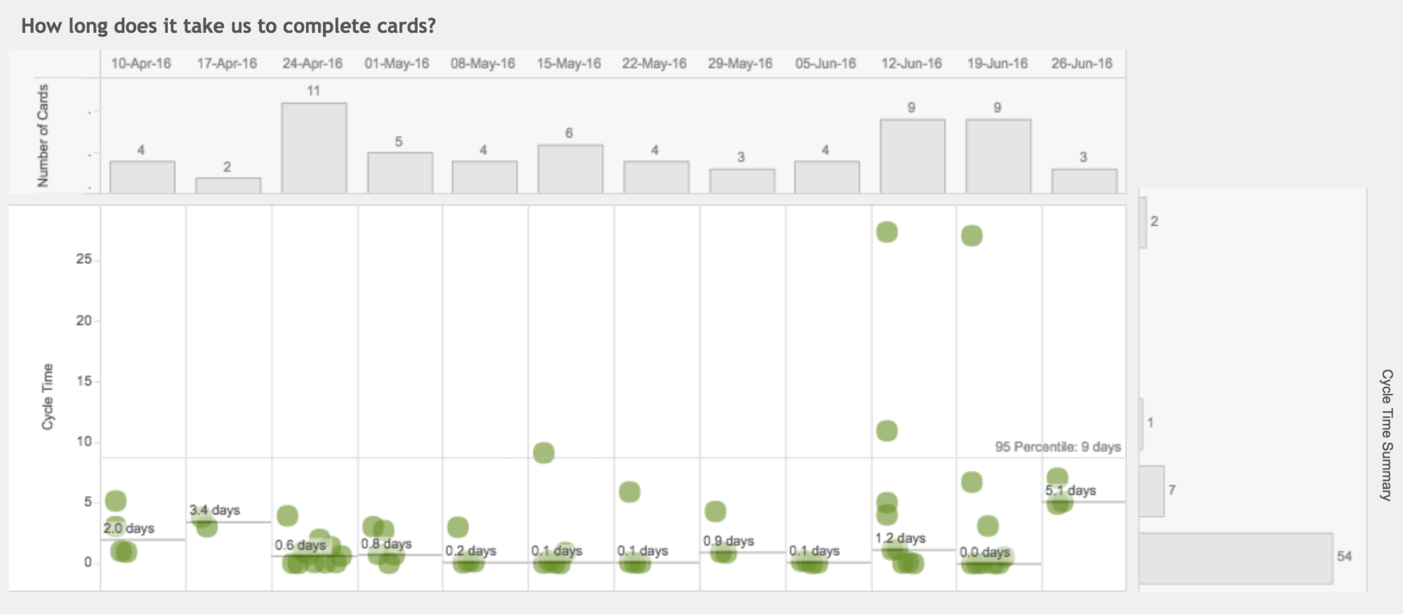
- For this type of work, 95% of the time we finish it within 9 days or less.
Throughput
To understand the average number of units, e.g. cards, completed per time period, e.g. week, look to the top bar chart. Throughput values can be a good indicator of process stability.
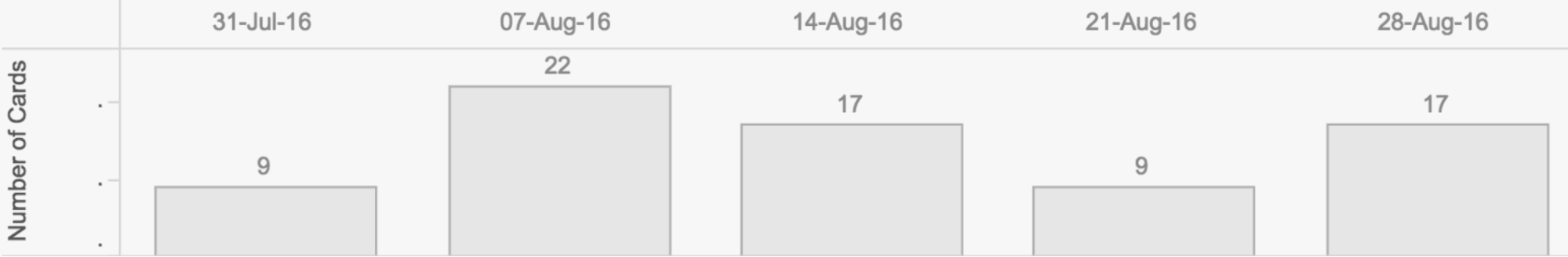
- Throughput bar chart showing number of cards completed each week for five weeks.
Consistency is Key
When throughput values are consistent, you can more reliably forecast how long it would take to complete a set amount of work. For instance, if you’re delivering 15 items per week and you have 45 items that have not been started, the likelihood that you’ll complete those 45 items in one week is very low (you’re looking at closer to three weeks).
When diagnosing instability, review throughput for each type of work you do. There may be specific types of work that are introducing variability — peaks and valleys — between each time period. It could be that only certain team members know how to do that work and there’s simply too much of it to find stability. The problem could be that that specific knowledge is spread too thin (need more of it, e.g. expertise in that area) or that incoming demand needs to be addressed (need less of it, e.g. technical debt slowing cycle time down).
Cycle Time Range

- Cycle time bar chart
Improving average cycle time is a common discussion among many teams. Reviewing how many cards were finished within a similar cycle time range, paired with the goal of increasingly making the bottom of this bar chart — where short cycle times exist — “heavy” with more cards, is a great place to start in that journey. Longer cycle times that live at the top of the chart mean that it’s time to investigate to understand cause. And then adjust based on your learnings.
Embrace Data and Improve
With the new Speed visualization, teams can easily identify problems, including inconsistent pace and variability of cycle time, so that you’re equipped to determine ways to improve process throughput and reliability.
Recommended Resources
- Webinar: How to Get Started with Continuous Improvement
- 7 Lean Metrics
- Improved Insights into the Distribution of Work
![A Global Collaborative Work Management Blueprint [Video]](https://blog.planview.com/wp-content/uploads/2019/07/A-Global-Collaborative-Work-management-blueprint.png)